Cozy Spring Jam 2023
“Paws in Bloom” Visual Novel
Project Overview
Details
Project:
3-day Game Jam “Cozy Spring 2023”
Hosted by Virtual Turtle Games
Teammates:
Kayla Deer: Lead Artist
Zack Zamiska: Programmer
Emily Jensen: Writer
Guilherme ASSUNÇÃO: Sound Designer
Project Details:
”Paw in Bloom” Game Jam Page link.
Game Jam hosted by “Virtual Turtle Games” on itchi.io. This jam’s theme was Spring Cozy, and open ended. My team decided on a simple Visual Novel with a “Cozy Fiction Novel” narrative style.
Project Scope:
3 Day Design Sprint/Jam
Build a Game Prototype
My Contributions
My Role:
UXUI Designer, Illustrator
Research:
User Usability Test
Competitive Analysis
Affinity Map
UI Design:
Sketches
Visual Novel UI Standards Research
Figma Prototyping for Test
UI Assets
Art:
Provided Sketches for Main Pages in Game
Provided Illustration aid to Lead Artist
This Page is in Progress!
Check out the Paws In Bloom Game Jam Page for our first prototype!
Phase One: 3-Day Game Jam
Research ➜ Sketches ➜ Prototype & Insights ➜ UI Design
Research
What the Heck IS A Visual Novel?!
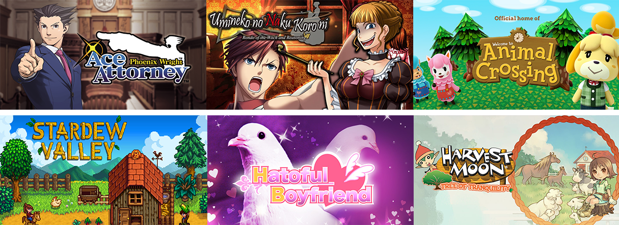
References. I dove in to piles of playthroughs of popular Visual Novels to learn more about Design Standards and common UI for visual novels. I also referenced popular games that are considered cozy for inspiration and comparison.
What I discovered is that visual novels are heavily influenced by the purpose of the story, and the player’s involvement in the progression of it. ‘Ace Attorney’, a mystery visual novel, encourages players to think critically about what the characters are saying by using unique font styles to communicate clues, and the game allows players to collect evidence to help build their case. ‘Hatoful Boyfriend’ includes a relationship tracking system, which influences how a player navigates down the path of multiple unique stories and scenes. The gameplay design of visual novels is completely different in these two cases, but I did find commonalities across all the games I referenced.
This helped me understand where to focus my efforts. Our visual novel was simply a one-path linear story, so I focused primarily on gathering references for how UI visually communicated a story’s progression, and potential controls a reader would like to use navigating.
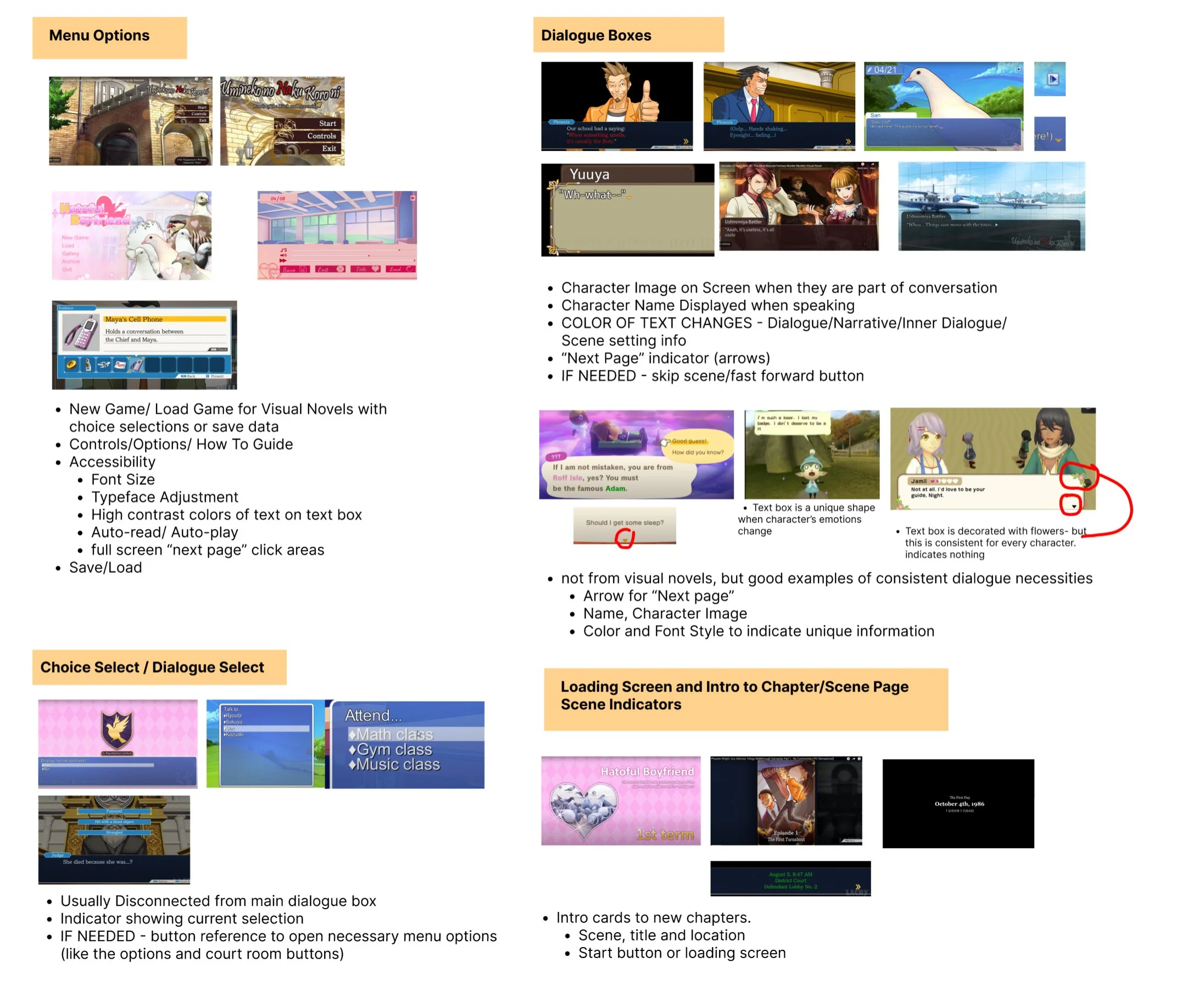
Visual Novel Necessities
Main Menu - Start, Load, Chapter Selection, Options/Controls (Accessibility), About Game
Pause Menu - Save (for games with unique paths/ save data.), Load, Continue, Back to Main Menu
Dialogue/Narrative Box - Character name, Character image, Consistent typeface rules (color, typeface and font style to indicate dialogue, setting and unique information)
Choice Box - separate from dialogue box, indicator for highlighted choice, prompting question/ reason for choice
Accessibility - Autoplay, Font Size and Typeface Options, Next Page, Back Page, High Contrast colors, Text-To-Speech, History, Full- Screen “next Page” Click areas
Sketches
Visualizing What I Learned (And Discovering New Questions!)
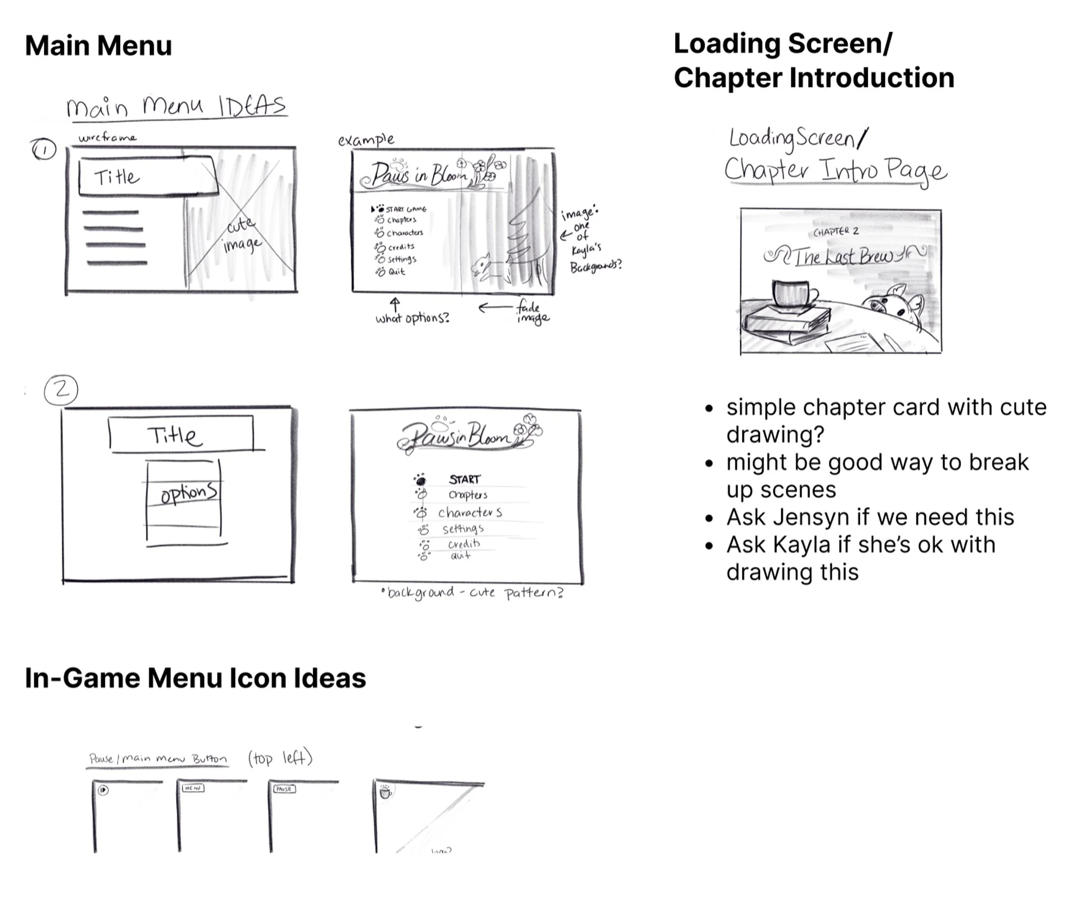
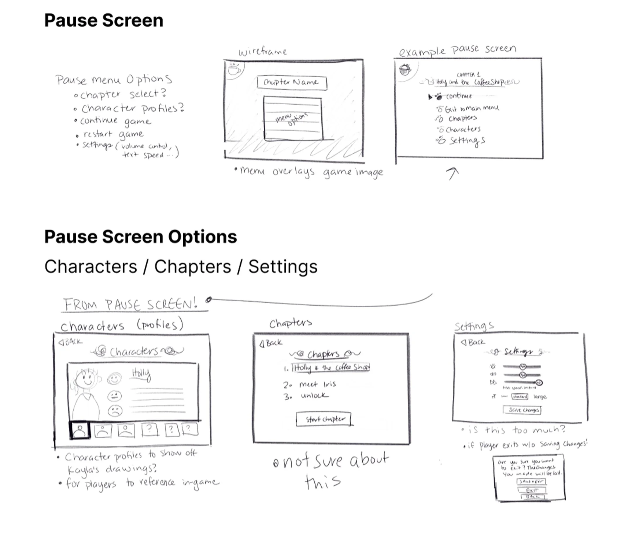
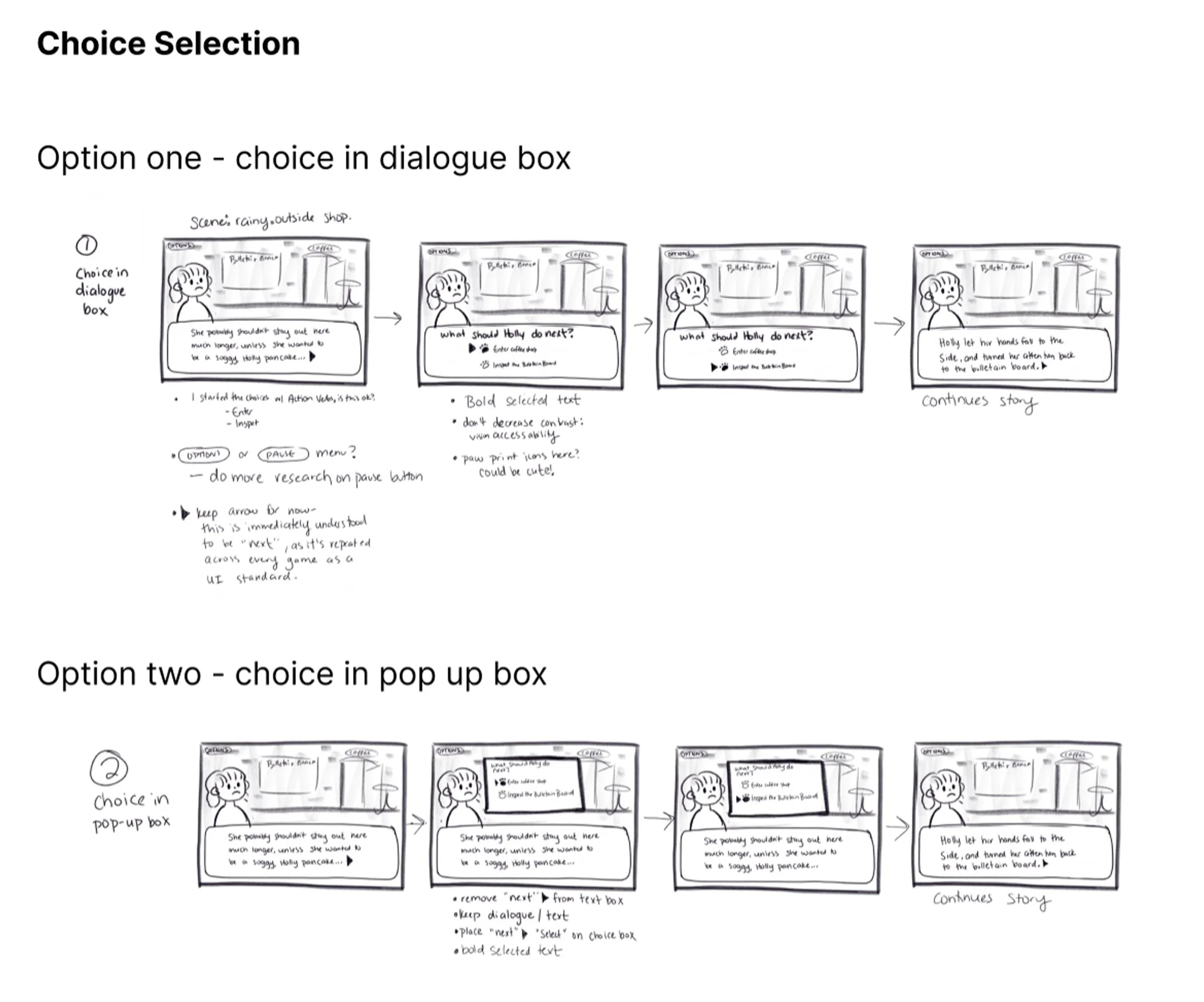
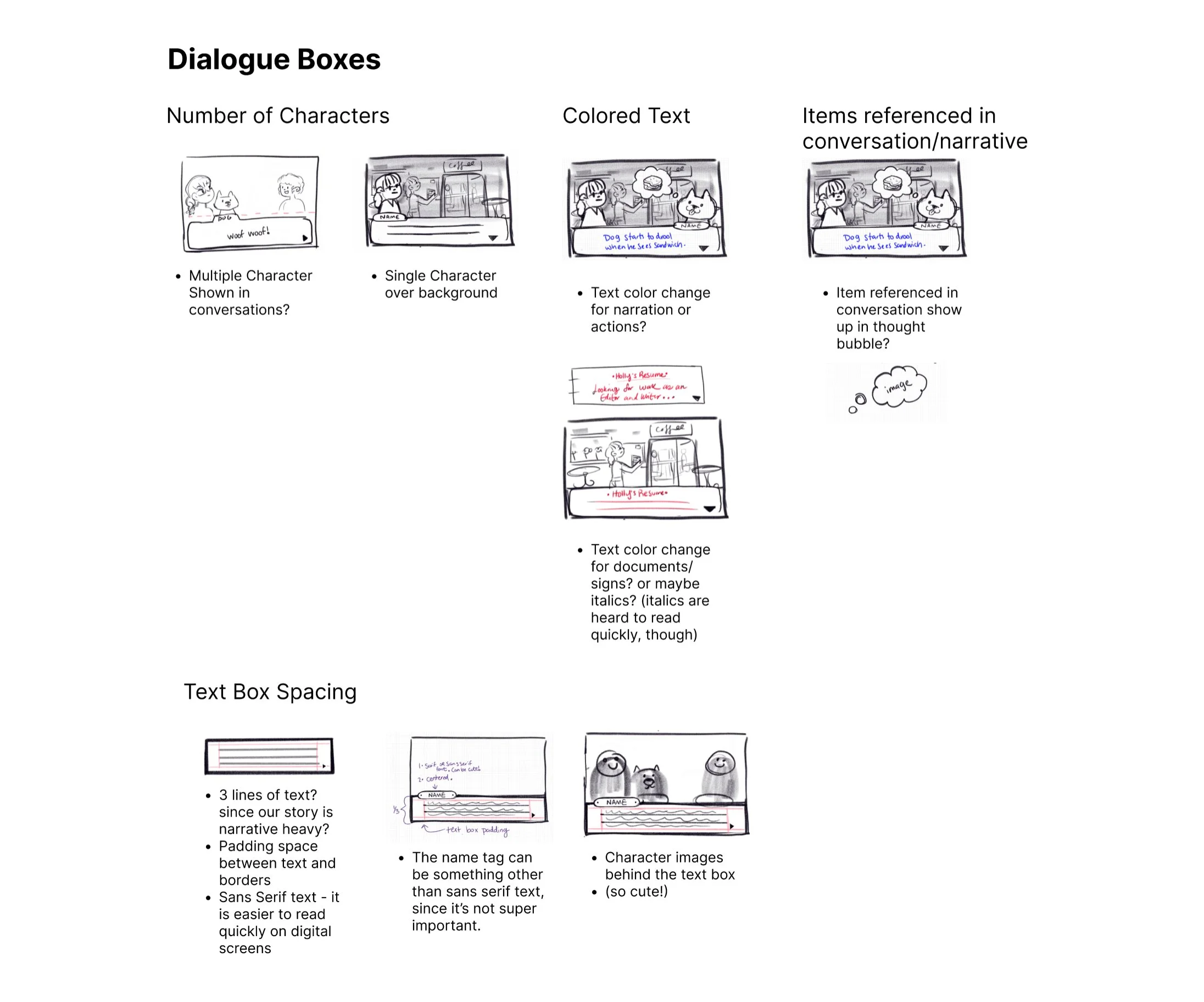
I sketched out ideas for each screen and menu layout we would need in order to build our visual novel. These were also sketched out to help me build a quick Figma prototype to get a better idea of what players expectations are for interacting with a visual novel. I focused on dialogue boxes, menus, chapter selection and intro screens, and choice selection boxes. Bonus - both the Lead Artist and the Programmer found these sketches to be a good leaping off point to start building their own pieces of the puzzle!
What are player’s expectations when it comes to text formatting in visual novels?
When interacting with visual novels, how do players expect to interact?
Prototype
Putting New Questions to the Test
My user test took the form of a Google Forms Questionnaire with inks to a figma prototype I designed on the first day. Because of the extremely short deadline, the do-it-yourself user test seemed like a better method to get a large amount of quick feedback (although I believe that watching in-person playtesting will ALWAYS be more informative). The prototype and questionnaire can be found here. The next morning, I had results from 14 participants after posting the link to this Google Forms to all my social media accounts (THANK YOU!)
The Figma Prototype’s Purpose…
I was still unclear on how to format the text and typeface. I was curious to know what text colors and font styles (bold, italic, quotes…) really communicated to players and what their assumptions were when seeing unique font in games. The story my team was working with was narrative-heavy and contained very little dialogue. We also had instances of in-game documents being read, and sound effects written out.
I decided to try colored blue text for dialogue, bold text for sound effects and in-game documents and normal text for the narrative. My quick prototype interspersed these text styles throughout the game, and guided users back to the questionnaire after a segment of “gameplay”, which prompted the users to reflect on their experience with the formats.

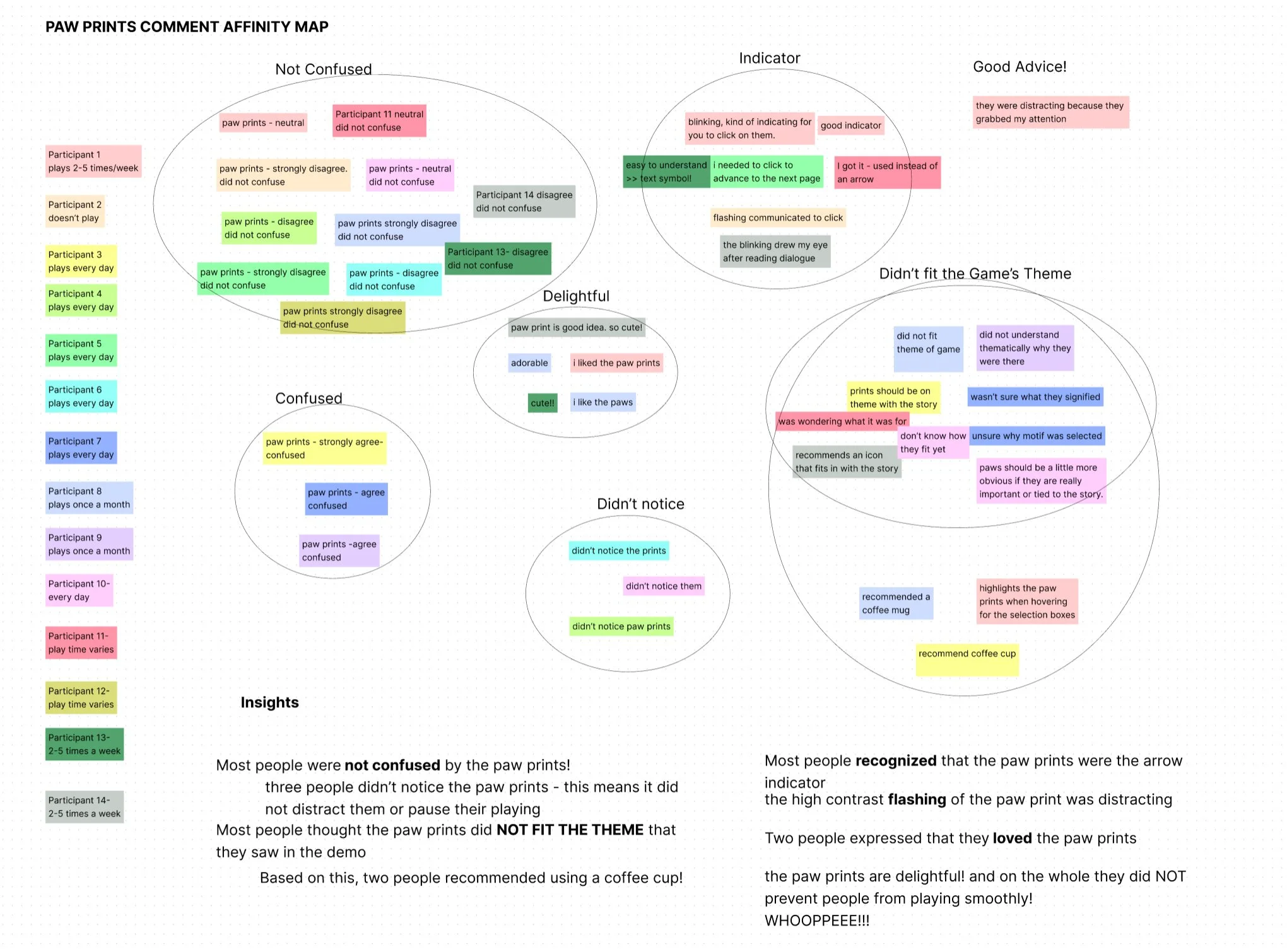
Another curiosity I had was about the common arrow symbol which appears after the text on dialogue boxes to indicate “click text”. I wanted to know whether or not changing the common blinking arrow indicator to a paw print would throw players off. My initial assumptions was NO, this would not work. I did not believe replacing an arrow with a paw print would work, because in every instance of games I saw the symbol never diverged from an arrow. The only part of the arrow design that changed was whether or not it blinked, and whether it appeared directly after text or if it was placed in the bottom right corner on the dialogue box. I decided to prototype this as well.
For my test, I placed a blinking paw print directly after the text. I believe having a paw print icon would be mistaken as decoration of placed in the bottom right corner of the dialogue box.

Finally, I wanted feedback on what players preferred for choice boxes! I had seen two major divergences on Choice Box designs. Some were pop-out menus and others were generated in the dialogue boxes. Some Choice Boxes included a prompting question/the last line of text, and others only showed the players their choices to select.

Prototype Test User Insights and Feedback!
Oh boy was I not prepared for these results! It was an absolute humbling delight to sift through the user feedback and figure out how to rebalance my assumptions on how to handle text.
Participant Demographics
Paw Prints replacing Arrow Indicator